Posts
Featured Post
Final Assignment

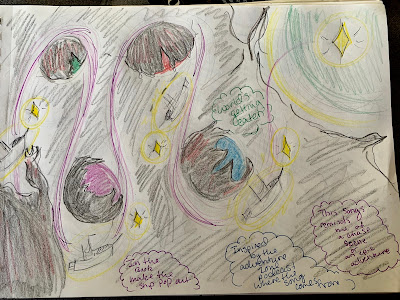
At first I did some idea/ concept sketches. I got the feel of what I wanted this book to look like. Then I did some story boarding. I listened to the song that I wanted to do over and over again. Then I laid out more of the story. While doing this I thought of adding some pop ups to make the ship pop out, and the color scheme which would've been some darker colors contrasted against lighter colors. But I tried to keep it simple at the same time. On the final product of this assignment I choose to do both gauche and color pencils.
Perspective

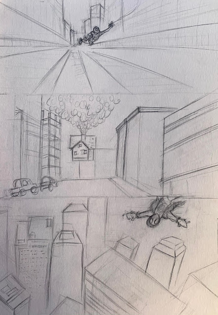
These are the images for my 1st, 2nd, and 3rd perspectives drawings. I choose two from "Spiderman Into the Spider verse" because I love the movie so much and it has a lot of scenes that have good perspective. I then tried to find the lines of perspective. Which was quite difficult for my untrained eye. Then the sketch. I did free hand with this assignment which shows. Then here is the final product
Sketch Book D Progress

I cut my pieces into mostly medium to small, because I liked smaller collages. The less there is the more people got what was going on in them. I took note into what I wanted my collages main themes to be; 1. Body image 2. Music 3. Politics 4. Food 5. Community 6. Animals/nature 7. Vacation Than I started rummaging through my basement and found the old New Year posters my mom used to make. They are posters of what you want to accomplish that year. I also found old newspapers, and colored paper. After I gathered all these items up I went to work cutting out what I needed, then I put them together. I really liked being simple and clean with my collages. The meaning in them is clear and to the point.
Pattern Progress

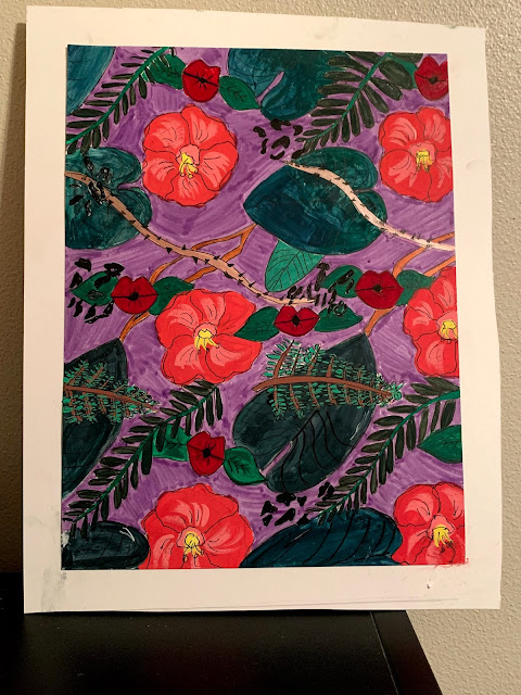
For my pattern I was inspired by the rainforest. Its so full of life and there are so many patterns to get from it that I just had to do it. I choose a more plant based pattern because when I think of rain forest I think of greenery and the vast amount of plant species found there. I had to include this unique plant, because look at it. Who wouldn't kiss those lips? I did my motifs centered around these pics, I made it so some of the elements were overlapping, because of how dense this habitat is. I wanted to make it so the design was cluttered but not too cluttered. The plants I choose are what I found most associated with the rain forest. The ferns and leaves, also the pretty flowers. I also did a leopard print with it, because I wanted to add a bit of an animal aspect to the pattern, but this pattern was mostly centered around the plants. I played around with the sizing and decided that I liked the first one better, it was a bit clearer and more towards ...


